Alliance for Clean Energy, New York
Centralizing clean energy by developing an interactive map that centralizes New York’s renewable projects into one engaging, user-friendly web platform
Role
Lead Product Designer
Team
1 Project Lead • 1 Designer
1 External Director • 5 Developers
Disciplines
Design Systems • 0 → 1
UI/UX Design • Client Project
Tools
Figma • Adobe XD
Timeline
February - May 2025

OVERVIEW
Alliance for Clean Energy, New York is an Albany-based NPO advocating for clean, renewable electricity technologies and energy efficiency in New York, focusing on energy diversity, economic development, public health and air pollution mitigation.
My team at Blueprint, Technology for Nonprofits was challenged to build map-based data visualization tool that catalogues and tracks every renewable energy project in New York State, creating a powerful tool for policy, accountability and public awareness.
USER PROBLEM
New York's clean energy transition lacks observability


A public facing map requires:
Clarity to drive confidence
Make the scale and distribution of New York’s clean energy projects immediately understandable without overwhelming users
Specificity to enable action
Enable users to quickly find and inspect individual renewable energy projects for analysis, advocacy, and public understanding
Simplicity to prevent disorientation
Keep map exploration intuitive and grounding so a public, non-technical audience never feels lost navigating complex data
THE CHALLENGE
How might we empower New York residents to understand and actively participate in the clean energy transition in ways that feel accessible, actionable, and impactful?
IDEATION
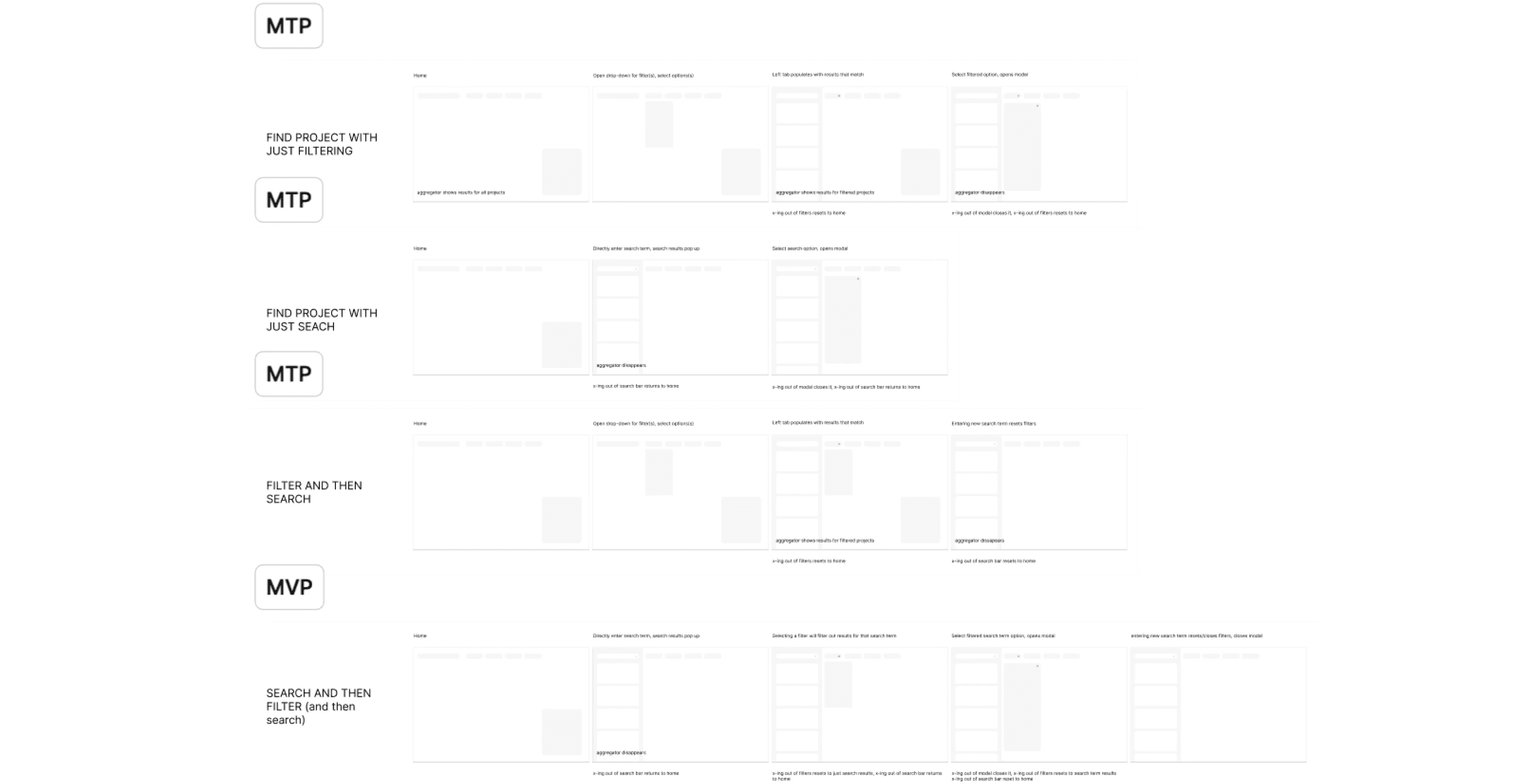
Defining Key Features Through User Flows
We translated client and stakeholder requirements into user flows designed for intuitive exploration. By supporting both top-down (search and filter) and bottom-up (map-first) discovery patterns, we ensured the experience balanced structure with flexibility.


WIREFRAMING
Prioritizing Layout & Information Architecture in Minimal Viable and Minimum Testable Product
ITERATION
Balancing technical constraints with user experience meant iterating key trade-offs
Decision #1: Removing progressive modals for streamlined usability

Before
Takes up too much visual real estate
Responsiveness issues for small screens
After
Most efficient use of space
Allows for streamlined user flow
Decision #2: Ensuring modals are modular and code scalable


Wind Farm
STATUS
TECHNOLOGY
LOCATION
PROJECT SIZE
Before
Not all projects have same widgets
Lack of distinction between segments
After
Easy to add or remove segments as needed
Dev-friendly to turn into React components
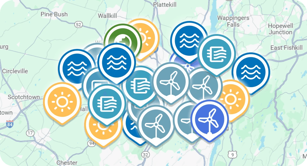
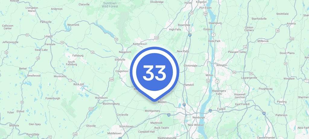
Decision #3: Marker clustering to decrease map clutter
Before
Doesn't follow design system
Created confusion during user testing

After
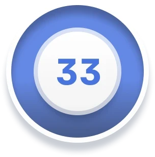
Mimics overall marker designs
Visually distinct enough from other markers
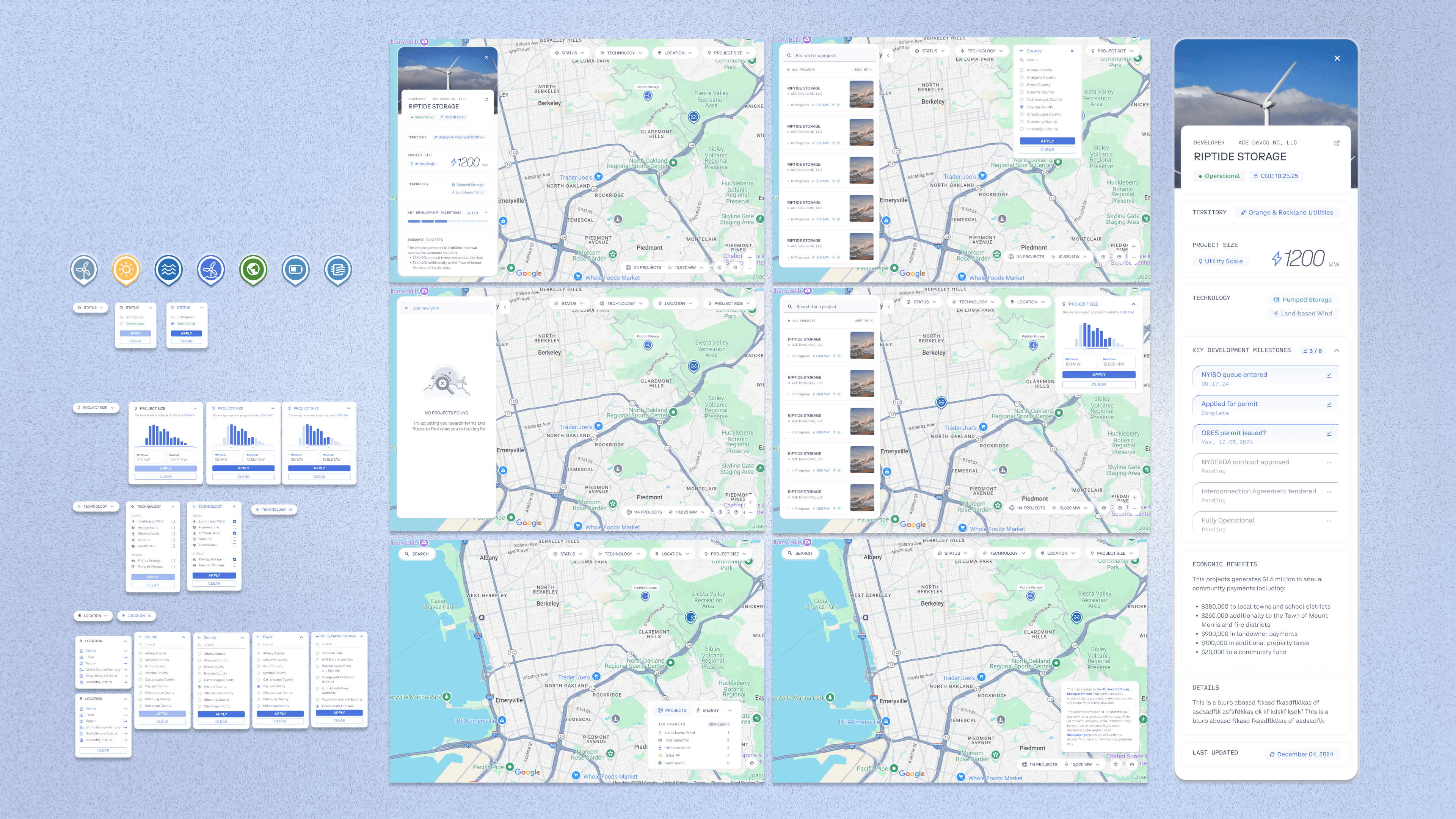
DESIGN SYSTEM
Bringing the Experience to Life with Branding and Visual Refinement
Colors
navy
rgba(46,58,89,1)
hsla(223,32,26,1)
#2E3A59
navy 85
rgba(77,88,114,1)
hsla(222,19,37,1)
#4D5872
navy 75
rgba(98,108,131,1)
hsla(222,14,45,1)
#626C83
navy 65
rgba(118,126,146,1)
hsla(223,11,52,1)
#767E92
navy 50
rgba(46,58,89,0.50)
hsla(223,32,26,0.50)
#2E3A59
solar panel
rgba(72,150,188,1)
hsla(200,46,51,1)
#4896BC
wind
rgba(109,162,184,1)
hsla(198,35,57,1)
#6DA2B8
water
rgba(60,160,190,1)
hsla(194,52,49,1)
#3CA0BE
white
rgba(255,255,255,1)
hsla(0,0,100,1)
#FFFFFF
earth
rgba(77,139,49,1)
hsla(101,48,37,1)
#4D8B31
tags
rgba(140,192,132,1)
hsla(112,32,64,1)
#8CC084
marker
rgba(73,116,224,1)
hsla(223,71,58,1)
#4974E0
ace green
rgba(27,165,70,1)
hsla(139,72,38,1)
#1BA546
solar
rgba(255,190,84,1)
hsla(37,100,66,1)
#FFBE54
evergreen
rgba(5,71,42,1)
hsla(154,87,15,1)
#05472A
Heading 1
Font
Coinbase Mono
Weight
Regular
Size
22px
Line Height
Automatic
Letter Spacing
0%
Text Decoration
None
Paragraph Spacing
0px
Case
Original
Subheading 1
Font
Coinbase Sans
Weight
Regular
Size
14px
Line Height
Automatic
Letter Spacing
0%
Text Decoration
None
Paragraph Spacing
0px
Case
Original
Body Text 1
Font
Coinbase Mono
Weight
Regular
Size
10px
Line Height
120%
Letter Spacing
0px
Text Decoration
None
Paragraph Spacing
0px
Case
Original
The quick brown fox jumps over the lazy dog.
Body Text 2
Font
Coinbase Sans
Weight
Light
Size
12px
Line Height
130%
Letter Spacing
0.25px
Text Decoration
None
Paragraph Spacing
0px
Case
Original
The quick brown fox jumps over the lazy dog.

SOLUTION
Transforming Complex Energy Data into an Accessible, Engaging Experience
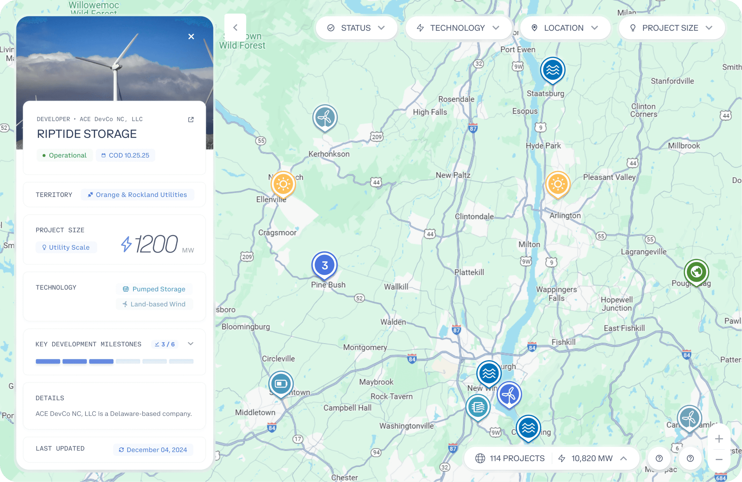
Our final design consolidated scattered datasets into a unified, interactive platform. Each feature was intentionally designed to balance usability, transparency, and scalability:
Interactive Map
Users can explore renewable energy projects across New York State using an interactive map, with intuitive zoom controls for viewing projects at both regional and local levels. Clear markers indicate each project’s location and energy type, with a legend to distinguish between wind, solar, hydroelectric, geothermal, and energy storage projects. An informational modal explains the app’s purpose and provides contact details for questions or data corrections.
Project-Specific Page
Each project has its own detailed page so users can get get a complete understanding of the project at a glance. Critical information includes:
Project Name
Operations Status
Commercial Operations Date
Project Size
Renewable Energy Technology
Key Development Milestones
Stackable filters for narrowing down projects with precision
The filter system allows users to quickly narrow projects based on energy type, project status, size, and location (counties, towns, and legislative districts) making it easy to find relevant data without navigating the entire map.


Aggregation System
Provides users with a summary of the projects currently displayed on the map, including:
Number of Projects
Total Energy Produced by Projects
Breakdown by Renewable Energy Technology
This helps users quickly understand the overall energy landscape at a glance.
Web Scraper
The platform automatically pulls project data from three key government databases: NYISO, NYSERDA, and ORES. The data is parsed, standardized, and stored in the app’s database.
Monthly Updates: Ensures the map displays the most current information.
Cloud Hosting: Data and the application are hosted on Google Cloud, providing reliable and scalable access.

TOOLS USED
Bridging Design and Code
I collaborated with engineers to define notification triggers and edge cases, and helped implement the notifications frontend by building reusable UI components and handling states such as loading, empty, and error conditions, help oversee design decisions translate cleanly into code.







LEARNINGS AND IMPACT
Designing for public clarity builds trust
Translating dense government datasets into plain language, intuitive filters, and consistent visual markers made renewable energy information understandable to non-technical users, increasing accessibility and confidence in the platform.
Systems thinking enabled long-term scalability
By creating modular components, reusable modal structures, and dev-friendly patterns early in this 0-to-1 build, the product could support evolving datasets, new project attributes, and future feature expansion without redesigning the core experience.
Simplicity had the greatest product impact
Streamlining modals, reducing map clutter through clustering, and refining information hierarchy helped users navigate 1.2K+ projects without feeling overwhelmed, turning complex infrastructure data into an intuitive exploratory tool.