Alison
Designing a Learning Management System for Educators in Developing Countries
Disciplines
UX Research • UI/UX Design • Prototyping • Client Project
Team
Daniel Lee Alison Dai Sam Hudson
Tung Nguyen
Madison Lee Daniel Roberts
Tools
Figma • Adobe XD
Timeline
September - January 2024

SUMMARY AND IMPACT
Over four months, our six-person design team redesigned Alison’s Career Ready Plan (CRP) educator experience, focusing on accessibility for teachers in developing countries. Partnering with Alison, a global platform with 40M+ learners, we built a Learning Management System (LMS) that streamlines class management, student tracking, and communication while accommodating low-tech environments. Our process included educator interviews, an LMS audit, and rapid Figma prototyping. The final design reduced navigation steps by 40%, improved clarity for users with limited digital literacy, and earned strong positive feedback from CRP educators on usability and accessibility.
CONTEXT
Limiting tools leave educators unable to fully support students
Career guidance resources are scarce in developing countries, with financial and technological barriers limiting access.
Alison’s CRP offers structured learning paths for in-demand skills, but educators lacked a platform tailored to their needs—something that could help them organize classes, track student progress, and maintain meaningful communication.


CHALLENGE
How might we design an accessible Learning Management System that accommodates educators’ needs regardless of experience level or resource availability?
COMPETITIVE ANALYSIS
How Could We Add Value?
We evaluated seven existing Learning Management Systems, identifying both accessibility challenges and notable strengths that aid educators. This analysis informed our design direction, highlighting opportunities to pair robust functionality with clear, streamlined interfaces tailored for low-tech environments.

Strengths
Wide variety of useful teaching tools
Streamlined interactions that minimize technical jargon
Intuitive options for customizing and managing students
Weaknesses
Bland, text-heavy UI that feels unengaging
Lack of visual and functional consistency across pages
Unclear feature hierarchy, making navigation confusing
USER RESEARCH
Engaging with Our Educators
To understand the real challenges educators face, we conducted 10 in-depth user interviews with high school and college career counselors, as well as college educators. These qualitative conversations revealed recurring pain points in organizing, managing, and delegating tasks within their current Learning Management Systems.
What we heard:

“I spend more time figuring out where things are in the system than actually helping my students.”
– High School Career Counselor
“Every platform feels like it was made for someone else. Nothing is really tailored to how I teach.” – College Educator


“It takes at least five clicks to get to the student info I need—by then, I’ve already lost time in class.” – College Career Advisor
USER PERSONAS
Educators need simple, accessible, and adaptable tools
Through our research, we found that technology literacy, resource constraints, and varying teaching styles shaped educators’ needs from a learning management system, leading us to identify two primary personas. One represents a novice educator new to the field and eager to explore innovative approaches to curriculum design, while the other represents an experienced counselor frustrated with existing systems and seeking a more streamlined, efficient LMS tailored to their expertise. Centering educators’ lived experiences within a complex platform, these personas guided our ideation phase and the development of prototypes for key pages of Alison’s new LMS.
Newcomer Educator Nina

Background
•
Recently started teaching (1–2 years)
•
Juggles teaching with other jobs or community roles
•
Limited experience with digital teaching tools
Enthusiastic
Optimistic
Unorganized
Tech-Curious
Goals
•
Use a platform that’s intuitive and quick to learn
•
Access ready-to-use resources for lesson planning
•
Support students in exploring career paths confidently
Pain Points
•
Unsure how to track and organize student progress
•
Difficulty reaching/notifying students
•
Struggles with maint
Needs
•
Intuitive navigation with minimal training required
•
Visual cues and simple workflows for everyday tasks
•
One-to-one student communication
Streamlined Counselor Sam

Background
•
10+ years in teaching or student advising
•
Comfortable with technology but frustrated by inefficient tools
•
Manages large groups and mentors other educators
Pragmatic
Organized
Results-Driven
Tech-Savvy
Goals
•
Manage multiple classes and groups efficiently
•
Quickly view student performance data
•
Keep communication with students simple and effective
Pain Points
•
LMS tools cluttered with features they don’t use
•
Too many steps to access key data
•
Limited ability to customize workflows
Needs
•
Organized dashboards with instant access to essentials
•
Tools for grouping students by career goals
•
Reliable performance in low-resource environments
SYNTHESIS
Streamlining class management starts with fewer clicks and clearer pages
Our design goals focused on:
Keeping navigation minimal and intuitive.
Ensuring important information is instantly visible.
Building communication directly into the LMS.
Allowing customization so educators can work the way they prefer
IDEATION
Ideating Our Implications
Throughout this phase, our team ideated on potential goals and solutions to address with the educator-facing dashboard and interface, focusing on the aforementioned design goals to ensure a personalized & accommodating experience.

USER FLOW
Clarity and efficiency come from mapping every step
To translate our ideas into a seamless experience, we created user flows that mapped how educators would navigate the platform—from logging in, to setting up a class, to tracking student progress.

PROTOTYPING
A single hub organizes onboarding, student tracking, and communication
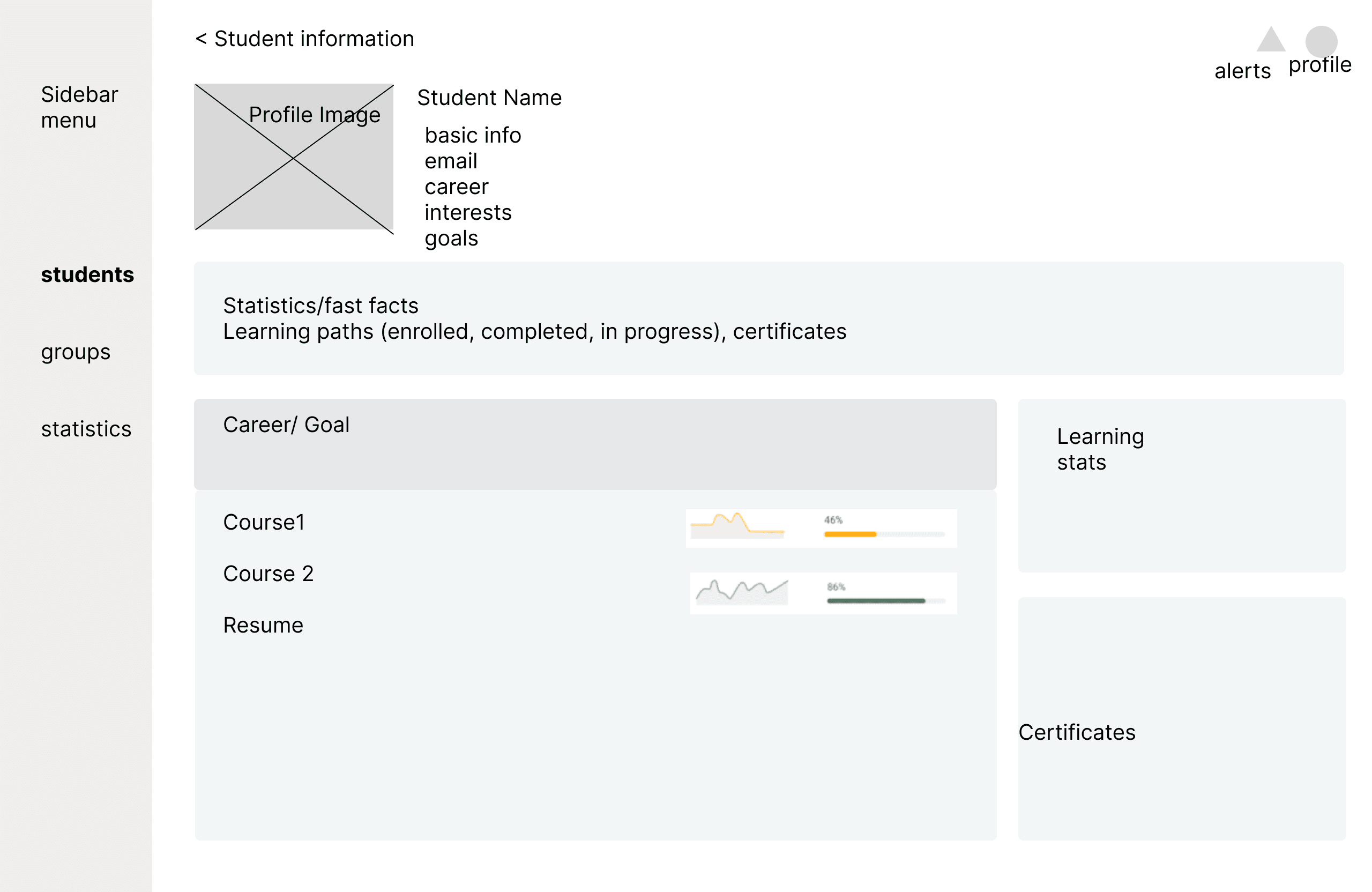
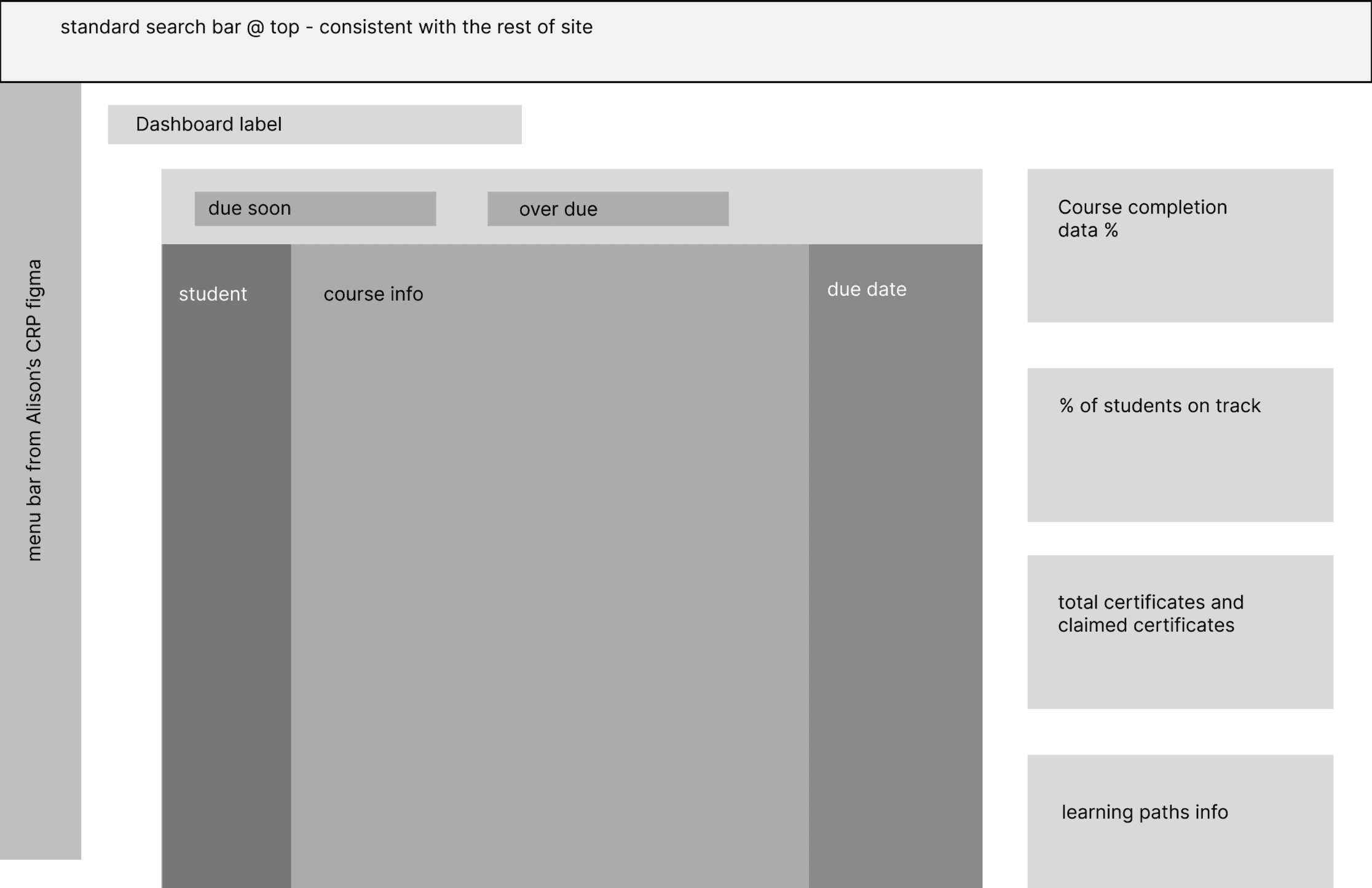
We began with low-fidelity wireframes for four key educator-facing pages:
Student Profiles
Class Onboarding & Roster selection
Student Groups

Educator Inbox

ITERATION
Designing in Cycles
Our team explored multiple directions for the educator-facing dashboard and interface, always grounding decisions in our core design goals of clarity, efficiency, and accessibility.
Through several rounds of usability testing on low-fidelity prototypes, we gathered valuable feedback on how educators navigated the platform. These insights highlighted moments of friction, revealed opportunities to streamline workflows, and ultimately shaped a more intuitive and accommodating experience.

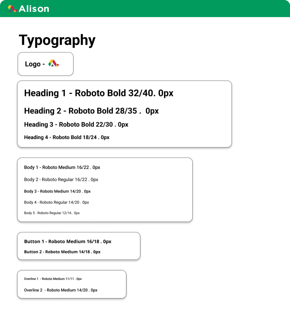
DESIGN SYSTEM
Balancing clean and welcoming visuals to be consistent with Alison's branding



FINAL DELIVERABLE
Introducing The Educator Hub
Class Onboarding & Roster Selection
This section of the educator-facing hub is dedicated to class formation and selection. To ensure a streamlined process, we limited the number of pages visited by the user, having all of the information needed on one individual page. Additionally all sections are designed with distinct colors and symbols to differentiate from one another.


Student Profile and Inbox Messaging
The student profile is an extensive review of all student materials, including current resume, certifications, course progress, and learning metrics. Through distinct visual markers, the educator is provided with a concise and clear center to support their students. Additionally, through the inbox messaging, educators are able to interact with their students in a more intimate, one-on-one space.
Student Groups
Groups are a simple and effective tool that educators can utilize to manage their students. In this iteration of the platform, students are grouped based on career goals to provide educators more context on how they can engage with their course material.

REFLECTIONS AND TAKEAWAYS
Organization Matters
Visual hierarchy and thoughtful layout decisions were crucial to reducing educator overwhelm. By structuring information in a clear, predictable way, we created a platform educators could navigate with confidence.
Design for Constraints, Not Against Them
Minimizing page loads, simplifying flows, and relying on clear iconography made the LMS usable even in low-bandwidth, low-resource environments.
Iteration Builds Better Products
Frequent feedback loops with educators ensured every design decision stayed grounded in real needs, not assumptions